
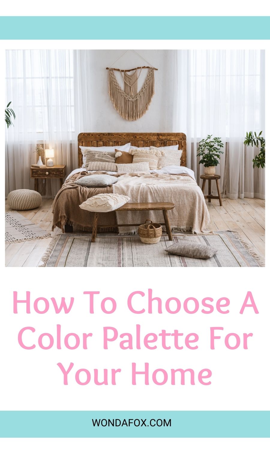
The colour you choose to paint a room can make a huge difference to the way it looks, feels, and compliments the rest of your furniture pieces.
Making the wrong decision can quickly make your room seem dark, cold, and uninspiring so it’s important to make pick the right shade for you.
However, choosing the right colour is always as simple as you would think it would be. If you need some help picking out hues and tones for your home makeover, here are some of the shades we think will completely change the way you look at home renovation.
Consideration before choosing what paint colour palettes to pursue
Before you start to even think about specific colours, it’s important to go through a few important considerations.
Think about the vibe you want to create in your space
Whether you’re working on your new custom home designs or just looking to spruce up one of your rooms, you should first think about the vibe you’re trying to create.
Do you want a fun, exciting room where your children can play and have fun, or do you want a neutral, minimalist vibe where you can come and relax after a busy day at work?
Understand your fixed elements
Have you already started to buy furniture for your room, or are there any existing features and fixtures that you have to work around?
Think about the things that you can’t change first and then try and find a paint colour that will compliment them.
Finding your favourite colours and style
Your home should be a reflection of your own personality, so don’t feel like you have to choose colours just because they’re on-trend.
Stay true to yourself and think about the colours that make you feel most comfortable and inspired.
Seek professional help
Not everyone has the skills to pick out the right colours, sometimes it takes the eye of a professional interior designer to help uncover the perfect picks for your space.
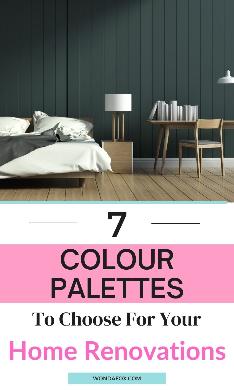
Colour Palettes to try for your next home renovation
Now that you’ve thought about all the important points, it’s time to pick out some colour combinations for your interior makeover.
Here are some of the most complimentary and exciting combinations that will look great in any room.
Neutrals + Chartreuse
If you’re trying to achieve a minimal retreat in your home, you’ve probably been sticking to off-whites, beiges, and light brown tones to give a relaxing vibe to your home.
But, if you want to add a slight splash of colour into your space, why not try chartreuse? This shade is halfway between green and yellow that really pops when placed alongside your classic neutral tones.
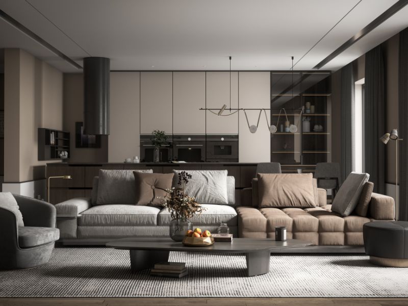
Earthy Tones
Earthy tones are the feature of a lot of interior design inspiration at the moment, and for good reason. Their rich, natural tones are perfect for adding a fresh and appealing ambiance to your abode.
Pairing rich blues, grassy greens, and dark browns together are the perfect choices for those who aren’t the biggest fans of bright colours but still don’t want to stick to a monochromatic look.
Deep Aubergine
The rich tones of a deep aubergine paint will never look out of place, no matter what room you decide to place it in.
A colour that seems to go with almost everything, you can easily paint your entire room with this beautiful shade or use it as an accent wall to compliment the rest of your colour choices.
Muted Palettes
Nothing creates a sense of peace better than a mixture of muted colour palettes in a room; think shades like washed out greens, dulled yellows and light greys.
Made by taking vibrant colours and mixing them with black, white, or other complimentary colours to give them a washed-out affect, these colours are perfect for bedrooms, living rooms, or other areas where you want to unwind.
Pastel Blended
Bring a springtime feel into your home every day by adding beautiful pastel shades into your room.
Pick out pastel shades to compliment neutral furniture, or to compliment any vibrant furniture pieces that are begging for all your attention.
Retro
Interior trends may feel like they’re always coming and going, but retro shades seem to never go out of style.
Travel back in time and create a room full of harvest golds, dusty roses and rich green shades like you’d see in rooms of retro past.
At the moment, shades from the 1970s are proving to be the most popular and pair well with an array of vintage-inspired furniture, retro light fittings and other flea market finds.
Warm Hues with Bright Pop ups
Finally, our last suggestion is to try mixing warm hues with bright pops of colour to add some interest and intrigue to your upcoming home makeover.
Warm hues like burnt reds, deep oranges and natural browns are perfect at adding a comfortable and cosy feel to your home but, when mixed with bright colours they can create a whole new atmosphere.
For those who want to keep their home looking stylish and unique, this combination of colours is the perfect approach. Whether you want to try different shades on different walls or just complimenting warm-toned paints with pops of brightly-coloured furniture, this is a trend that will never fail you.
Conclusion
In this article, we’ve taken you through some of the most stylish and unique colour combinations that will be perfect for your upcoming home renovation projects.
From updating your minimal vibe with chartreuse, to mixing warm hues with bright pops of colour, there are a range of different atmospheres that you can create with just a few licks of paint.
Now, all that’s left for you to do is to start brainstorming which colours you want to use in your home. So, follow our tips and get stuck into painting – we can’t wait to see what you come up with.

